
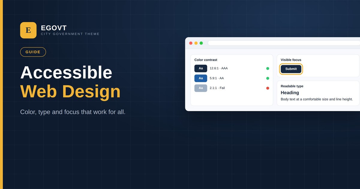
Accessibility isn’t only a development task — most of it is decided in design. The colors, type, spacing and interaction patterns you choose determine whether a citizen with low vision, a motor impairment or a cognitive disability can use your site. These are the design principles that make a public-sector website work for everyone.
Color and contrast
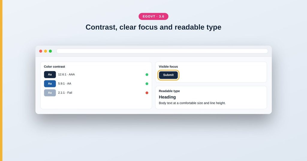
- Meet WCAG contrast: at least 4.5:1 for body text, 3:1 for large text and meaningful icons.
- Never use color alone to convey meaning — pair it with text, an icon or an underline.
- Check states (links, buttons, errors) for contrast too, not just body text.
- Avoid light-gray-on-white, the most common contrast failure.
Typography and spacing
- Use a readable base size (around 16–18px) and a comfortable line height.
- Keep line length moderate so text is easy to track.
- Left-align body text; avoid justified text, which creates uneven gaps.
- Leave generous spacing so the page is easy to scan and tap.
Focus and interaction
- Give every interactive element a clearly visible focus state — never remove focus outlines.
- Make click/tap targets large enough and well-spaced.
- Ensure menus, sliders and modals work with a keyboard, not just a mouse.
- Don’t rely on hover — it doesn’t exist on touch, and hides content from keyboard users.
Forms and inclusive patterns
- Give every field a visible label; don’t use placeholder text as the label.
- Show clear, specific error messages next to the field.
- Group related fields and keep forms short.
- Support reduced-motion preferences and avoid content that flashes.
Start from an accessible theme
You can design all of this from scratch, or start with a theme that already gets the fundamentals right. Egovt ships with accessible defaults — readable type, sufficient contrast and visible focus states — so your design foundation is sound before you customise. Pair these principles with the WCAG 2.2 checklist to verify the result.
Tips
- Design in grayscale first to test that layout works without color.
- Keep a small, consistent color and type system.
- Test designs at 200% zoom and on a real phone.
- Include people with disabilities in your testing when you can.
Accessible design is one part of meeting your obligations. For the complete picture — WCAG, ADA, Section 508 and privacy — see our government website accessibility and compliance guide.
A design foundation you can trust
Egovt is designed with accessible defaults — readable type, sufficient contrast and visible focus — so your site looks professional and works for everyone. See the live demo.
Frequently asked questions
What makes a website design accessible?
Sufficient color contrast, readable typography, visible focus states, large tap targets, keyboard-friendly interactions and clear forms — choices made mostly in design, not just code.
What contrast ratio do I need?
At least 4.5:1 for normal body text and 3:1 for large text and meaningful icons, per WCAG Level AA.
Why are focus states important?
Keyboard and screen-reader users need to see which element is focused. Removing focus outlines makes a site unusable for them, and fails WCAG.
Does the theme affect accessibility?
A lot. The theme sets your defaults for contrast, type, focus and semantics. An accessibility-ready theme like Egovt starts you much closer to compliant.
